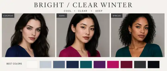
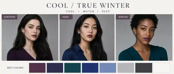
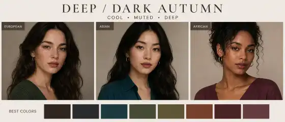
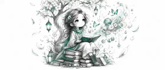
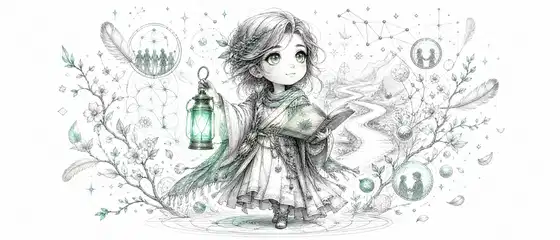
Bright Winter — Bright / Clear Winter: who suits this color type and how to use it in life
The color type Bright Winter is often noticed not by one specific feature, but by the overall effect of the appearance: the face looks expressive, clear, contrasting, and as if "composed" of clear, saturated colors. This type usually suits cold, ringing, bright shades without dustiness and murkiness. The article will be useful for those who want to better understand their colors in clothing, makeup, accessories, and hair coloring — without strict rules and without being tied to origin, country, or skin tone.
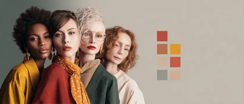
It is important to remember: Bright Winter is found in people with very different appearances. This color type can be found in people with light, medium-tan, olive, golden-beige, deep dark skin. Hair can also vary — from very dark to softer options, as long as the overall contrast of the appearance remains high, and the colors are pure and cold-neutral. The main idea is not about nationality or one eye color, but about the combination of temperature, contrast, depth, and saturation.
Brief portrait of the color type
Bright Winter is one of the most contrasting and pure in palette winter types. The appearance gives an impression of clarity, graphicness, and energy. In short, it's not about softness and muteness, but about clarity and visual strength.
Temperature: usually cold or cold-neutral. Obvious warm golden softening usually looks less organic.
Contrast: high. Often noticeable contrast between skin, hair, eyes, eyebrows, and lips.
Depth: from medium to deep. The appearance may not necessarily be very dark, but it usually has visual density.
Saturation: high. Muted and dusty shades often lose out next to the face, while pure ones look more lively.
Overall impression: brightness, clarity, freshness, sometimes even the effect of a "precious contrast".
When comparing Bright Winter with other types, it usually looks more saturated and contrasting than soft and natural palettes, and cooler than bright warm types. It suits colors that seem pure, cool, intense, and slightly radiant.
Visual guide to palette and style

How to understand that this is your color type
Bright Winter can be recognized not only by individual colors of appearance but also by how the face reacts to different shades of clothing. When a person of this type wears a successful color, the appearance looks composed: the eyes become more noticeable, the skin appears smoother, and the facial features clearer. If the color is too warm, dusty, or blurred, the face may seem tired, less expressive, or visually "lost."
Here are the signs that are often found in Bright Winter:
pure, cold, and saturated colors suit you, especially if they have noticeable brightness;
black and white combinations often look impressive and do not "swallow" the appearance;
bright fuchsia, cobalt, emerald-cold, pure berry, icy pink look good next to the face;
too warm earthy shades can make the image heavier;
pastel with a gray undertone often looks too dull compared to your natural brightness;
your appearance can be noticeable even without complex makeup, especially if there is contrast in clothing.
At the same time, the appearance of Bright Winter does not have to look the same for everyone. One person may have very dark hair and light skin, another — deep dark skin and bright whites of the eyes, a third — medium skin tone, cold dark chestnut hair, and very clear eyes. The important thing is not the template, but the visual logic: cold-neutral temperature, brightness, clarity, and contrast.
If you are in doubt between several types, it is useful to conduct a simple test in front of a mirror in daylight: compare pure white and milky cream, fuchsia and warm coral, cobalt and dusty blue, charcoal black and soft chocolate. Bright Winter often favors clear, cold, and contrasting solutions.
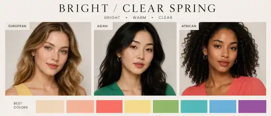
Best colors for Bright Winter
The palette of this color type is built around pure, cool, saturated, and contrasting shades. Colors should not be too blurred, dusty, or earthy. The best work are colors that look as if "lit from within" — clear, noticeable, graphic.
Basic colors
charcoal black;
pure white;
graphite;
ink blue;
cold dark gray;
deep sea blue.
These shades are convenient to use for coats, jackets, trousers, skirts, shoes, and bags. They create a strong base against which accent colors look especially beautiful.
Light shades
Light colors in Bright Winter are usually not creamy and not powdery-warm, but rather cool and transparent in impression. They work well in shirts, blouses, tops, scarves, and print details.
Dark shades
Such colors add depth to the image without losing the characteristic winter purity.
Accent colors
These are the colors that make Bright Winter particularly striking. They are suitable for dresses, blouses, lipstick, scarves, jewelry, manicures, eyeglass frames, and even sportswear.
Neutral colors
Bright Winter's neutrals should be quite pure. If a neutral color looks too sandy, warm, or dusty, it can "dull" the natural brightness of the face.
Colors to be cautious with
Bright Winter usually finds it most challenging to deal with not dark or light colors per se, but with muddy, earthy, and overly warm shades. This doesn't mean they can't be worn at all. It's just that near the face, they often appear less flattering.
Warm mustard and ochre: can clash with the cool clarity of the appearance and add a sense of heaviness.
Rusty, terracotta, brick: sometimes look too dry and grounded next to the bright winter contrast.
Dusty rose, gray-beige pastels: can make the face less expressive.
Olive swamp: often "dulls" the purity of the appearance's colors.
Warm peach and apricot: often seem separate from the face rather than supporting it.
Soft chocolate and caramel: often lose out to cooler and more contrasting dark shades.
If you like such colors, it's better to use them further from the face — for example, in shoes, belts, skirts, pants, or in small elements of a print. You can also balance them with cool accessories, white, graphite, bright lipstick, or a contrasting top.
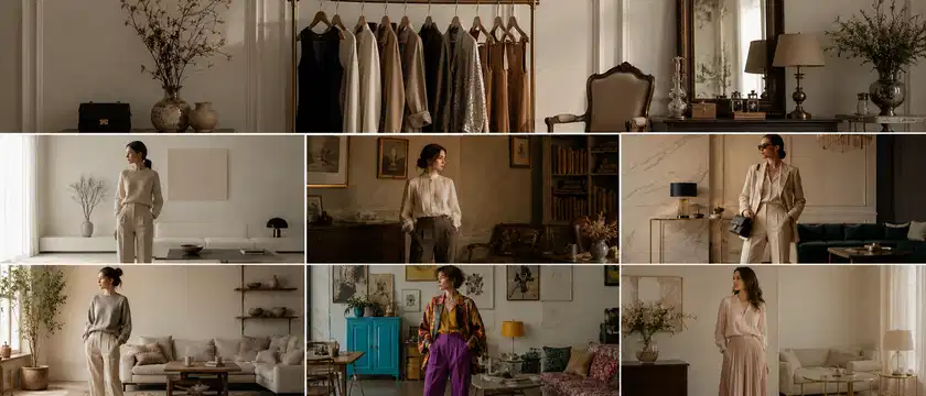
Clothing and style
Bright Winter is especially well-revealed in styles where there is clarity of lines, purity of color, and thoughtful contrast. This doesn't mean the look has to be strict. It's just that solutions with visual clarity rather than blurriness look best.
Suitable stylistic directions
Casual: white T-shirt, dark blue jeans, black jacket, sneakers with graphic details.
Smart casual: graphite-colored pants, white shirt, cobalt top or fuchsia accent in accessories.
Minimal: clean lines, monochrome, black-and-white combinations, smooth fabrics, minimal extra decor.
Elegant: dress in cool ruby, ink, or emerald shade, laconic jewelry, clear bag shape.
Urban: contrasting combinations, smooth-textured leather, graphic glasses, rich accents.
Sporty chic: bright electric-colored jacket, white top, black pants, clean lines, and modern silhouette.
Romantic in a winter key: not warm and powdery, but cooler — with berry, icy, and shimmering shades.
Examples of successful looks
white shirt, black straight pants, silver earrings, bright fuchsia lipstick;
cobalt dress, graphite shoes, clear bag in a cool black shade;
dark indigo jeans, icy pink top, black blazer, and bright cyclamen scarf;
black turtleneck, cool emerald skirt, silver accessories;
white top, dark blue suit, ruby lipstick, and laconic earrings.
Bright Winter usually suits prints with high clarity: contrasting stripes, geometry, abstraction with clear boundaries, black-and-white motifs, floral patterns with bright pure colors. Too blurred watercolor patterns often appear weaker.
Makeup
Makeup for Bright Winter works best when it emphasizes the natural clarity of the appearance, rather than trying to make it warmer and softer at any cost. The main goal is to maintain freshness, purity, and contrast.
Tone
Foundation products are usually better chosen with a neutral-cool or cool direction, without pronounced yellowness or orange effect. The finish can be natural, satin, or slightly radiant, but without the feeling of a heavy mask. A tone that is too warm can visually separate from the neck and body, while overly matte and dense can deprive the face of liveliness.
Blush
Strongly peachy and reddish blushes often look less harmonious. If you want warmth, it's better to add it very sparingly and not make it the basis of the look.
Lips
Too warm beige-peachy nudes can make the face look less bright. It's usually better to choose a nude with a pink, berry, or neutral-cool base.
Eyes
Eyeliner in black, graphite, or cool dark blue often looks very advantageous. Mascara — black or very dark cool brown if you want it softer. It's better to avoid an excess of orange-copper, warm-gold, and dirty-bronze effects: they can clash with the natural clarity of the appearance.
Hair color
Bright winter usually suits hair shades that support its natural contrast, cool-neutral temperature, and clarity. This doesn't mean everyone needs a very dark color. It's much more important that the shade doesn't veer into reddish, murky caramel, or dusty warm softness if it makes the face lose expressiveness.
Most often, the following look harmonious:
cool black;
blue-black in moderation, if it doesn't look too theatrical;
cool dark chestnut;
pure dark chocolate without a reddish undertone;
cool medium chestnut while maintaining contrast with brows and eyes;
cool dark shades with a glossy shine.
If you want lightening, usually cool, contrasting, and pure directions look better: for example, cool highlights, graphic lightening near the face, cool dark balayage without copper and golden streaks. Too warm caramel strands often look separate from the face rather than as its continuation.
More controversial can be:
If you really want a warm shade, you can try it in a softer format — for example, not near the face, but in the depth of the length, maintaining the overall cool balance of the look through clothing and makeup.
Jewelry and accessories
Accessories for Bright Winter are better chosen by the same principle as clothing: clarity, contrast, coolness, clarity of form. Too vintage-dusty, matte, and earthy items may look weaker than clearer and more graphic solutions.
Metals
silver;
white gold;
platinum metal shade;
cool steel shine.
Yellow gold can also be worn, but often a cooler or neutral metal works better, especially near the face.
Glasses, bags, scarves
Glasses: black, graphite, clear cool, deep blue, burgundy-berry frames.
Bags: black, graphite, white, ruby, cobalt, emerald, with a clean shape.
Scarves: contrasting, with a clear print, in a cool bright palette.
Prints and Textures
geometry;
contrasting stripes;
abstraction with clear lines;
cool floral prints on a dark background;
animal print in a cool interpretation.
Textures that often look good include smooth, shiny or semi-glossy surfaces, dense cotton, suiting fabrics, satin, and leather with a clean finish. Too loose, faded, dusty textures may appear less expressive.
Mini Capsule Wardrobe for Bright Winter
If you want to quickly assemble a practical base, you can start with a small capsule where items are easily combined with each other:
black or graphite jacket;
white shirt or white top with a pure cool undertone;
dark blue or black trousers;
deep indigo jeans without heavy distressing;
dress in cobalt, ruby, or cool emerald shades;
jumper in fuchsia, cyclamen, or icy pink;
black or graphite bag with a clear shape;
silver earrings or a simple chain;
scarf with a black-white-berry or blue-white contrasting print;
shoes in black, graphite, or cool burgundy shades.
Even with these items, you can create many combinations: white top and dark bottom for everyday wear, a bright dress for going out, a fuchsia jumper with jeans for casual, a jacket and cobalt top for smart casual.
Common Mistakes
Choosing too warm neutrals. A beige-caramel base may look heavier than white, graphite, and cool blue.
Leaning towards dusty shades. Soft dustiness often weakens the natural brightness of this type.
Too "natural" makeup in warm tones. Peach-beige tones can make the face less expressive.
Warm hair coloring. Copper and golden nuances often clash with the overall cool clarity of the appearance.
Lack of contrast in the look. If the entire outfit is too soft and monochrome beige, the appearance may lose character.
Too much muted knitwear and faded fabrics. They can visually "dull" the face.
Fear of bright accents. Bright winter often reveals itself through one strong color — lipstick, scarf, top, earrings, or bag.
Brief Conclusion
Bright Winter is a color type about clarity, coolness, saturation, and contrast. It often suits pure whites, blacks, graphites, cobalts, berry, and emerald shades, while warmer and muted solutions may look less advantageous, especially near the face. But a color type is not a strict set of prohibitions. Rather, it's a convenient tool that helps you quickly find your colors, create harmonious looks, and better understand why one item "enlivens" the face and another does not. The better you feel your palette, the easier it is to shop and the more confident the entire look appears.
FAQ
1) Can this color type be found in people with dark skin?
Yes, of course. Bright Winter occurs in people with a wide range of skin tones — from light to deep dark. The defining factors are usually not origin or skin lightness level, but contrast, color purity, and a cool-neutral direction of appearance.
2) Can I wear black?
Yes, for Bright Winter, black is often one of the most successful base colors. It supports contrast and emphasizes the clarity of appearance. If pure black seems too strict in a particular look, it can be softened with white, berry, cobalt, or silver accessories.
3) What if I like a color that is not in the palette?
You can wear it. The most practical approach is to place such a shade further from the face: in shoes, a bag, trousers, a skirt, or pattern details. You can also combine it with colors that suit you better to keep the overall look harmonious.
4) How do I know if I have a warm or cool undertone?
The easiest way is to compare fabrics near the face in daylight. If pure white, fuchsia, cobalt, cool berry, and silver metal look better near the face, and warm beige, peach, mustard, and gold make the appearance less fresh, you likely have a cool or cool-neutral direction. But it's better to assess not just one feature, but the overall picture.
5) Can I change my color type with hair coloring or tanning?
Hair coloring, makeup, and tanning can change the overall impression of appearance, but they usually do not completely change the natural basis of the color type. Rather, they can temporarily bring you closer to another palette or, conversely, make familiar colors less successful. Therefore, it's useful to focus on how the face looks without filters and in natural lighting.