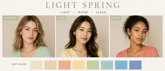
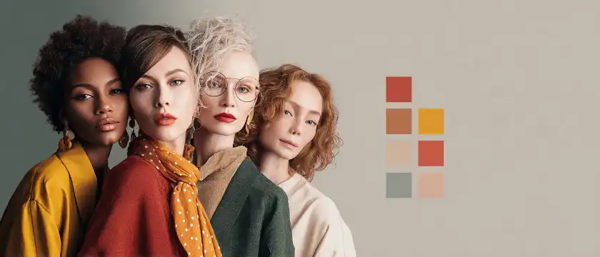
Compared to other seasons, Light Spring is usually warmer and more lively than Light Summer, but softer and lighter than Warm or Bright Spring. Its main strength is in delicate clarity. It's not a palette of dense, rich colors. It is more suited to shades that seem to be illuminated by daylight.
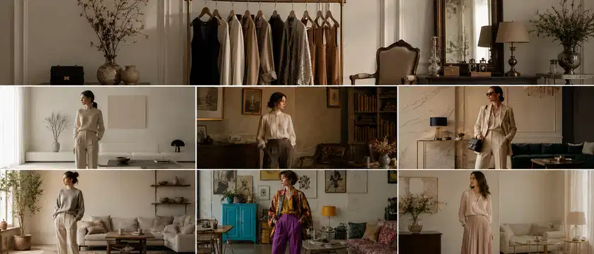
Visual Guide to Palette and Style
How to know if this is your color type
You can recognize yourself in Light Spring not by one sign, but by a combination of several observations. Very often, a person notices that in too dark, cold, or dusty shades, the face looks stricter, older, or more tired. But in warm, light, and pure colors, the appearance suddenly becomes more composed, lively, and refreshed.
Here are signs that are often found in Light Spring:
The skin suits softly warm, light, fresh shades: ivory, creamy, light peach, warm beige, gentle mint.
Sharp black near the face can "take away" the softness of the appearance and make the features harsher.
Very cold colors, especially icy gray-blue or bluish-pink, often make the face less radiant.
Too dark and dense shades can weigh down the image, even if they seem beautiful on their own.
The best work is done by light, warm, clear colors without excessive dustiness.
The appearance often looks more harmonious when there is a sense of light, freshness, and soft warmth in the clothing.
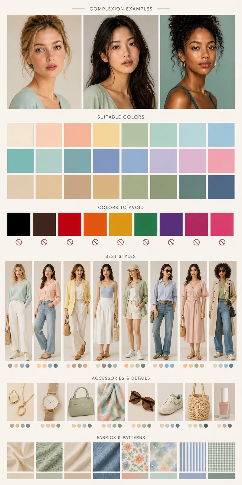
Important: Light Spring can be found in people with very different skin tones — from very light to tan and dark. Similarly, hair can be not only light brown or blonde, and eyes not only blue. Some may have golden-brown eyes and warm light skin, others light hazel eyes and neutrally warm tan skin, and others soft green, amber, gray-green, or light brown iris shades. The essence is not to match someone's photo, but to see if your appearance is better revealed in warm, light, and clear colors or not.
Another useful guide is comparing fabrics near the face. If you alternately apply, for example, creamy and pure white, peach and cold pink, light coral and wine, warm aquamarine and dark blue-gray, it often becomes noticeable which shades "lift" the face and which take away softness. In Light Spring, warm, light, and more transparent mood colors usually win.
Best colors for Light Spring
The main principle of the Light Spring palette is light, warm, pure, and easy. These are colors without heavy grayness, too much depth, or icy coldness. They can be noticeable but not aggressive; fresh but not acidic.
Base colors
The base for Light Spring should be softer and lighter than the classic "office neutral." Instead of harsh and dense shades, it's better to choose delicate, sunny options.
These colors are especially good for shirts, t-shirts, knitwear, pants, jackets, and basic dresses.
Light shades
It is in the light part of the palette that Light Spring is revealed especially beautifully. Here, not only tenderness is important but also liveliness.
These shades work well in blouses, summer dresses, tops, cardigans, scarves, and jewelry near the face.
Dark shades
Even a light color type can have deeper colors in their wardrobe. But for Light Spring, they usually shouldn't be too dense, cold, or dramatic. It's better to choose "lightened" dark options.
They look better in bags, shoes, belts, jackets, and the lower part of the outfit, rather than directly near the face in very large volumes.
Accent colors
Light Spring doesn't have to dress only in beige. Bright, friendly, and pure accents suit them very well.
These colors enliven the look and are especially good in small or medium doses: top, scarf, earrings, bag, print, shoes, or one bright item in a calm base.
Neutral colors
Neutrals for Light Spring are not a boring background, but a support for natural freshness.
If a versatile wardrobe is needed, these neutrals are conveniently combined with each other: for example, ivory + sand + light turquoise, or warm beige + coral + caramel.
Casual
One of the most successful options. For a casual wardrobe, light jeans, sand-colored pants, ivory t-shirts, apricot or light mint knitwear, milk or caramel-colored sneakers, and light striped shirts with a warm white background are well-suited.
Example look: light beige pants, ivory top, soft coral cardigan, light brown bag, and golden earrings.
Smart casual
For more composed outfits, Light Spring suits soft business solutions without too harsh contrast. Instead of a black suit, you can choose a set in warm beige, light camel, soft turquoise, light olive, or warm navy shades.
Example look: oatmeal-colored jacket, ivory top, light caramel-colored pants, cognac-colored loafers, and a silk scarf with a coral-mint pattern.
Minimal
Minimalism for Light Spring works especially beautifully if it is not too cold. Instead of graphic black and white, it's better to use milky, sandy, warm beige, light turquoise, and soft golden metal. This way, the look remains clean but doesn't seem strict.
Romantic
The romantic direction is often very harmonious for this color type: semi-transparent fabrics, light drapery, pastel-warm flowers, watercolor patterns, soft necklines, peach and creamy shades. It's important here that the romance feels fresh, not too dusty.
Natural
The natural style is another successful direction. Linen, cotton, soft denim, woven textures, light leather, caramel or honey suede, leaf prints, thin stripes, light checks. This style well supports the natural softness of Light Spring.
Elegant and urban
If you prefer more composed and urban looks, choose light elegance over harsh drama: a sheath dress in a warm turquoise shade, a sand-colored trench coat, an ivory blouse, a bag in a soft cognac shade. Instead of contrasting black details, it's better to use caramel, golden-beige, or warm sea tones.
Sporty chic
Sporty-urban looks can also look great: a light cream-colored suit, ivory sneakers, a melon-colored T-shirt, a light turquoise windbreaker, a sand-colored baseball cap. For Light Spring, this style is especially good when items appear fresh and neat, not rough and too dark.
Makeup
Makeup for Light Spring often looks best when it highlights the liveliness of the face rather than creating a heavy mask. It's especially important to remember transparency, warmth, and lightness. Even if you like more noticeable makeup, fresh and clean shades usually look more harmonious than overly dark or cold ones.
Tone
It's better to choose foundations with a natural finish — not too matte and not too dense. The shade should support the natural undertone of the skin: warm or neutral-warm, without obvious pink or ashy grayness, if it's not inherent to you. A too dense matte layer can deprive the face of the very light glow that adorns this color type.
Blush
Look good:
Too cold pink-lilac blush often looks separate from the face and can make the overall appearance less natural.
Lips
The most harmonious options usually lie in the warm, light, and fresh range:
Very dark wine and cold plum lipsticks can draw attention and make the appearance visually heavier. If you want more expressive lips, it's better to try warm coral, juicy salmon, or soft red with an orange undertone.
Eyes
For the eyes, usually suitable are:
Instead of coal-black eyeliner, brown, warm gray, olive, or turquoise often look more successful. Mascara can be brown, warm graphite, or softly black if you want a bit more expressiveness.
Effects that are often better to avoid: heavy matte contouring, very dark smoky eyes, bluish-cold eye makeup, sharp black eyeliner for everyday, too gray nudes, and excessively whitening highlighters. All of this can conflict with the natural softness of the color type.
Hair color
Light Spring often looks harmonious with hair shades that have warmth, light, and naturalness. But this doesn't mean everyone needs to be blonde. More importantly, coloring usually looks better if it doesn't lead the appearance into too dark, ashy, bluish-cold, or artificially contrasting directions.
Usually successful directions are:
soft golden and honey nuances;
warm beige blonde;
wheat;
light caramel;
honey;
light amber brunette;
delicate balayage with warm highlights;
coloring that maintains a soft transition without harsh stripes.
If you have a darker natural base, this does not exclude Light Spring. In such cases, warm highlights, caramel and honey overtones, and a slight softening of the color near the face often look particularly beautiful, rather than radical darkening or strong cooling.
What can often clash with the appearance:
blue-black;
very dark cool chocolate;
ash blonde without warmth;
silvery-gray shades;
too contrasting ombre;
cool red with a purple undertone.
Such choices can make features appear sharper and distance the appearance from its natural freshness. If you want to experiment, it's better to try warmer and lighter interpretations of your favorite color.
Jewelry and Accessories
Accessories for Light Spring look better when they support warmth and lightness, rather than adding heavy drama.
Metals
Most often particularly harmonious:
Too cold bright silver sometimes looks a bit harsher, although it can also be worn in mixed jewelry or in very light designs.
Glasses
Transparent warm shades, honey, light caramel, champagne, soft golden, light olive, warm turquoise are well-suited for frames. A black massive frame can draw too much attention, whereas lighter and brighter models usually better capture the natural balance.
Bags, Scarves, Shoes
Winning colors: sandy, caramel, cognac, ivory, light camel, warm turquoise, coral, soft mint. Scarves are especially useful for this color type because they are close to the face and can literally "illuminate" the appearance with the right shade.
Prints and Textures
Usually look best:
light stripes;
watercolor floral motifs;
small or medium natural print;
delicate check;
patterns with a white-cream base;
light geometry without harsh contrast.
Particularly good textures include cotton, linen, silk, viscose, soft knitwear, light suede, smooth leather, straw, delicate weaving. Too coarse, very dark, and dense textures can visually "outweigh" the appearance.
Mini Capsule Wardrobe
If you want to start practically, here's a simple example of a capsule for Light Spring with 9 items. All pieces can be easily combined with each other.
Ivory t-shirt.
Shirt in a light sand or cream shade.
Cardigan or light jumper in a gentle coral color.
Pants in a light beige or oatmeal shade.
Light jeans with a soft blue undertone.
Dress in warm turquoise or aquamarine color.
Jacket in light caramel or linen beige color.
Bag in cognac or honey shade.
Scarf with a combination of ivory, peach, mint, and coral.
From this capsule, you can create many combinations: ivory + light jeans + coral cardigan; sand shirt + beige pants + caramel jacket; aquamarine dress + cognac bag + golden jewelry. Even a small number of successful colors noticeably simplifies clothing choices.
Common Mistakes
Below are mistakes often made by people with Light Spring. These are not strict prohibitions, but useful guidelines.
Choosing too much black near the face. Black can look striking on its own, but it often turns out to be too heavy for a light spring appearance.
Opting for ashy and cool tones because they seem “universal.” In practice, cool grays and icy shades often make the face look less fresh.
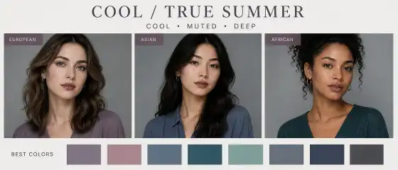
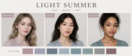
Confusing Light Spring with Light Summer. Both are light in appearance, but Light Spring is warmer and more vibrant, while Light Summer is cooler and more muted.
Going for overly dusty, grayish nudes. They can make the look dull, especially if they lack clarity.
Wearing makeup that is too dark for expressiveness. For Light Spring, expressiveness often comes not from darkening, but from freshness and light.
Choosing hair coloring that sharply increases contrast. Very dark or overly cool hair can clash with natural softness.
Ignoring accessories near the face. Sometimes the right scarf, earrings, or frames do more than a complete wardrobe change.
Conclusion
Light Spring is about soft warmth, light, clarity, and natural freshness. If your appearance comes alive next to ivory, peach, coral, mint, aquamarine, and light warm neutrals, you might be very close to this color type. But the main thing to remember is: a color type is not a strict set of rules or a list of “can/cannot.” It's a convenient tool that helps you choose harmonious colors faster, better understand your appearance, and create looks in which you feel like yourself.
Start small: replace one dark base color with a lighter warm one, try a different scarf, new lipstick, or softer frames. Sometimes it's the small changes that give the most noticeable and pleasant results.
FAQ
1) Can this color type be found in people with dark skin?
Yes, it can. A color type is determined not by skin tone itself or origin, but by the overall combination of temperature, depth, contrast, and saturation of appearance. A person with dark skin can also have a light, warm, and clear overall impression characteristic of Light Spring.
2) Can I wear black?
Yes, you can. It's just that for Light Spring, black near the face often looks heavier than softer alternatives. If you like black, try using it in shoes, bags, skirts, pants, prints, or pair it with ivory, peach, turquoise, or golden accessories. This way, the look can appear lighter.
3) What if I like a color that is not in the palette?
Wear it with pleasure, but adapt it. You can move it further from the face, choose an accessory in that color, mix it with more suitable shades, or find a similar but warmer and lighter version. A color type helps, not restricts.
4) How do I know if I have a warm or cool undertone?
Look not only at veins or individual internet tips, but at the overall effect on the face. Compare warm and cool fabrics in daylight: peach and cool pink, ivory and snow white, warm turquoise and icy blue. If in warm shades your skin looks fresher and features softer and more harmonious, then the warm direction is likely closer to you.
5) Can I change my color type with hair dye or tanning?
Completely changing your natural color type is usually not possible because it is related to your natural color harmony. Hair dye, tanning, makeup, and clothing can change the impression of appearance, enhance or diminish certain features, but the basic color often remains the same. That's why even after a makeover, some colors continue to flatter, while others clash with the face.